Alerts
The alert dialog displays some important information to the user. StackUI provides 4 different color schemes of alerts to show case relevant system alert to users. Class alert can be used along with the other classes to give the sementic meanings to the alert messages. alert-success, alert-warning, alert-info, alert-error
Profile has been updated successfully!
Low disk storage, clear some space.
An update is available to install.
There was an error processing your request!
Avatars
Avatar is basically the display picture of a user. It generally is very small in size and the sizes can vary depending on the use case. Stack UI provides a generic avatar class that can be used in association with any of 6 standard sizes for your avatars. avatar-xs, avatar-xs, avatar-s, avatar-m, avatar-l, avatar-xl, avatar-xxl. Check below the important classes and the way to implement.


Text Avatar
Similar to image avatars, text avatars can use those classes. One thing to note is that text avatars should mandatorily have the avatar-text.
Avatar Group
An avatar group can be used to showcase how many users contributed or participated in some event. To implement a avatar group just wrap all the avatars within a container with class named avatar-group.

Badges
Badges can be used to communicate the status of a user. It can also be used a signal for other users to understand if someone is online or offline.
Avatar with badges
Badges indicate the status of the user. example-> Green: online
For badges on image avatars use a span tag that has following
classes: avatar-badge along with any of
these classes: badge-red,
badge-green,
badge-yellow
Icons with badges
For badges on icons simply use a span tag that has the class: badge along with any of these classes: badge-red, badge-green, badge-yellow
Cards
A card is a group of related information, generally comprises of an Image, a title, some data like price, rating, description and sometimes also has a call to action buttons.
Normal Card Variants
The following examples contains the Textual Cards and the Cards with close icon
Textual Card
Lorem ipsum dolor sit amet consectetur adipisicing elit. Molestiae saepe sequi dolor natus? Perferendis, omnis harum necessitatibus assumenda unde consectetur corrupti blanditiis dolore repudiandae? Id earum rerum quis dolor autem maiores assumenda culpa ipsam, esse perspiciatis enim. Libero, aliquam repellat nemo ex, quidem odio, sit illum nihil architecto laudantium reprehenderit!
Card that closes
Lorem ipsum dolor sit amet consectetur adipisicing elit. Molestiae saepe sequi dolor natus? Perferendis, omnis harum necessitatibus assumenda unde consectetur corrupti blanditiis dolore repudiandae? Id earum rerum quis dolor autem maiores assumenda culpa ipsam, esse perspiciatis enim. Libero, aliquam repellat nemo ex, quidem odio, sit illum nihil architecto laudantium reprehenderit!
Vertical Cards: Image & Text
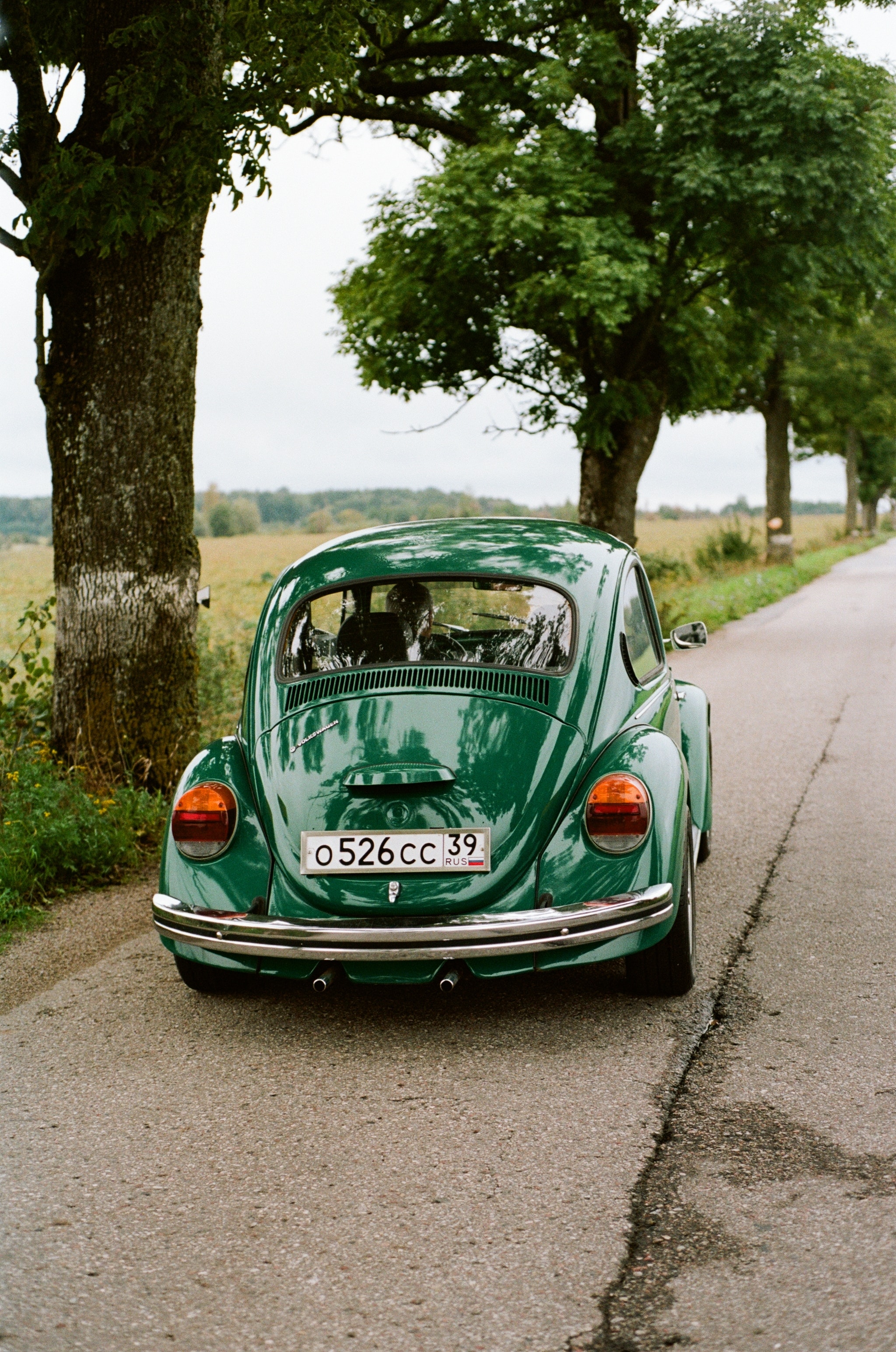
3D Printed Tesseract
Hub 3D, Delhi
1679 reviews
delivery by tomorrow

3D Printed Rudra
Hub 3D, Delhi
7.9K reviews
delivery by 8th March

3D Printed Diamond
Hub 3D, Delhi
5.7K reviews
currently Sold Out
Horizontal Cards: Image & Text
The html structure remains the same for horizontal class as well, One just need to replace the main wrapper class from card-wrapper-v to card-wrapper-h. See below the code example for better understanding.
3D Printed Tesseract
Hub 3D, Delhi
1679 reviews
delivery by tomorrow
3D Printed Rudra
Hub 3D, Delhi
7.9K reviews
delivery by 8th March
3D Printed Diamond
Hub 3D, Delhi
5.7K reviews
currently Sold Out
Responsive Images
Responsive images change their aspect ratio according to the container it is contained in. Stack UI provides the container img-wrapper that allows you to wrap your image and get it displayed in a responsive nature. You can change the height and width of the wrapper according to the usecase.

Round Images
To get your images rounded, simply add the img-round class to your wrapper class.
Inputs
Inputs are used to collect data from users directly in form of texts, numbers, clicks, checkboxes, radio buttons etc. Different styles are provided by StackUI for your labels, inputs, different colored borders that has sementic meanings. They can be used separately when needed or within a form group.
Input Variations
Modal
A modal is a dialog box/popup window that is displayed on top of the current page disabling all the other content on the page for that instance. The modal is wrapped within a modal-overlay class and the modal content is wrapped within the modal-wrapper class. Check below the implementation in css and javascript.
HTML Code for Modal
Javascript Code for Modal
Rating
A rating component can be used on any ecommerce platform, where we need to collect user experience with product or service in forms of rating. Use the id rating-star for each stars and the class names according to the value of the star such as rating-star-1, rating-star-2, rating-star-3, rating-star-4, rating-star-5
HTML code for Rating
Javascript code for Rating
Slider
Sliders are majorly used to take inputs from user that ranges between two values. A minimum value and a maximum value. Wrap your slider with the class slider-container and the slider with the class slider. Also see below the code snippet for more understanding of the usage,
Typography
Various text utility classes that can be used to design text based use cases. Below are all the examples for Headings, paragraphs, span, and more. Headings classes span from h1, h2, h3, h4, h5, h6. These heading classes can be associated with the primary-color and secondary-color to color them according to the use case.
Headings
Heading One
Heading Two
Heading Three
Heading Four
Heading Five
Heading Six
Heading One
Heading Two
Heading Three
Heading Four
Heading Five
Heading Six
Paragraphs and Spans
For paragraphs stackUI provides three variant of sizes: p, p-sm, p-xs in decreasing order respectively.
For spans stackUI provides two variant of sizes: span, span-sm in decreasing order respectively.
To color any text into grey you can use: text-grey.
Normal paragraph text.
Small paragraph text.
Extra small paragraph text.
normal span text. small span text.this is a grey text.
Alignment
Align any text using these classes: text-left, text-center, text-right
Centered text
Left-aligned text
Right-aligned text
Lists
Lists are integral part of any webpage, it can be found in navigation component or used to display bunch of related data.
Stacked Lists
StackUI provides different variants of the unordered lists, we can implement any type using the specific classname for the "ul" tag. ul class is common for all in associations with any of these classes: ul-circle,ul-square,ul-disc,ul-alpha,ul-lower-roman,ul-upper-roman respectively.
- apple
- guava
- orange
- banana
- pears
- apple
- guava
- orange
- banana
- pears
- apple
- guava
- orange
- banana
- pears
- apple
- guava
- orange
- banana
- pears
- apple
- guava
- orange
- banana
- pears
- apple
- guava
- orange
- banana
- pears
Spaced Lists
For spaced list items you can use this class ul-flex-spaced and thats it. :)
- apple
- guava
- pears
- lemon
- mango